Wednesday, August 17, 2016
Tableau Torch Contest #5 Entry
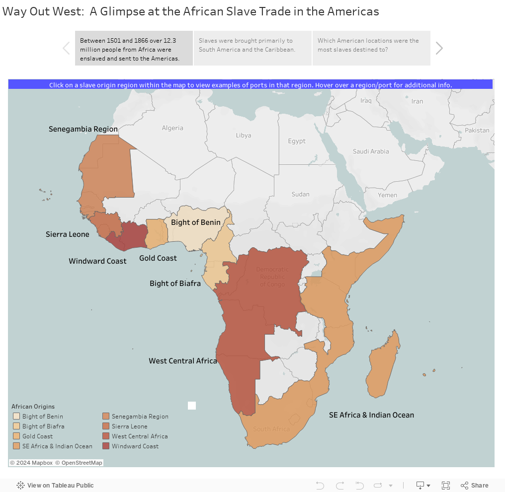
After being a Tableau Torch bearer from the Atlanta to DC leg, I felt motivated to participate in the last Tableau Torch Viz Contests -- using Custom Territories. The theme of contest #5 was 'Her name is Rio'. Here is my entry.
Wednesday, November 4, 2015
Tooltippin' Presentation
On 10/29/2015, I gave a presentation to the Atlanta Tableau User Group on using tooltips.
You wouldn't get dressed up for a special occasion to put on unpolished shoes or a pair of flip-flops; so why would you leave your tooltips looking like this:
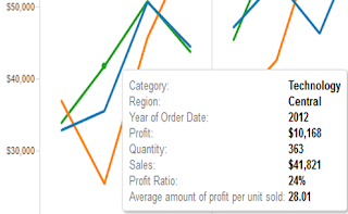
when you can make them look like this:

Lets take a look at when to and not to use tooltips, how to use tooltips effectively, and go through how you can polish up your vizzes using color and carats.
Below are some 'Easy Peasy' ways to use tooltips effectively
(with some info coming from blogs by Andy Cotgreave and others on this subject)
The information presented below may be nothing new to those who've been using Tableau for quite a while, but for those just starting out, I hope this information helps you create better visualizations.
Using the SuperStore Sales data set, create a simple line chart. Place Region and YEAR(Order Date) on the columns shelf and SUM(Sales) on the rows shelf. Place Category on the color shelf.


Next, create some calculated fields to make some comparisons with (so we have a reason to use color and carats). I've used the following calculations:


Drag each of the Sales Comparison % fields and the tooltip title fields to the Detail Shelf. Go to Worksheet|Tooltip... and format the tooltip similar to the following:

When adding the Sales Comparison % fields (and the Category Title fields), place them back-to-back so that there are no spaces between them. Only the value that is appropriate will remain, the others will vanish (but if spaces are present between the fields, these spaces will also remain).
Now assign colors. I set the color of the category titles based on the colors found in the workbook. I also used a muted green and a muted red to show positive and negative sales percentage, and a dark grey for no increase or decrease in sales percentage.
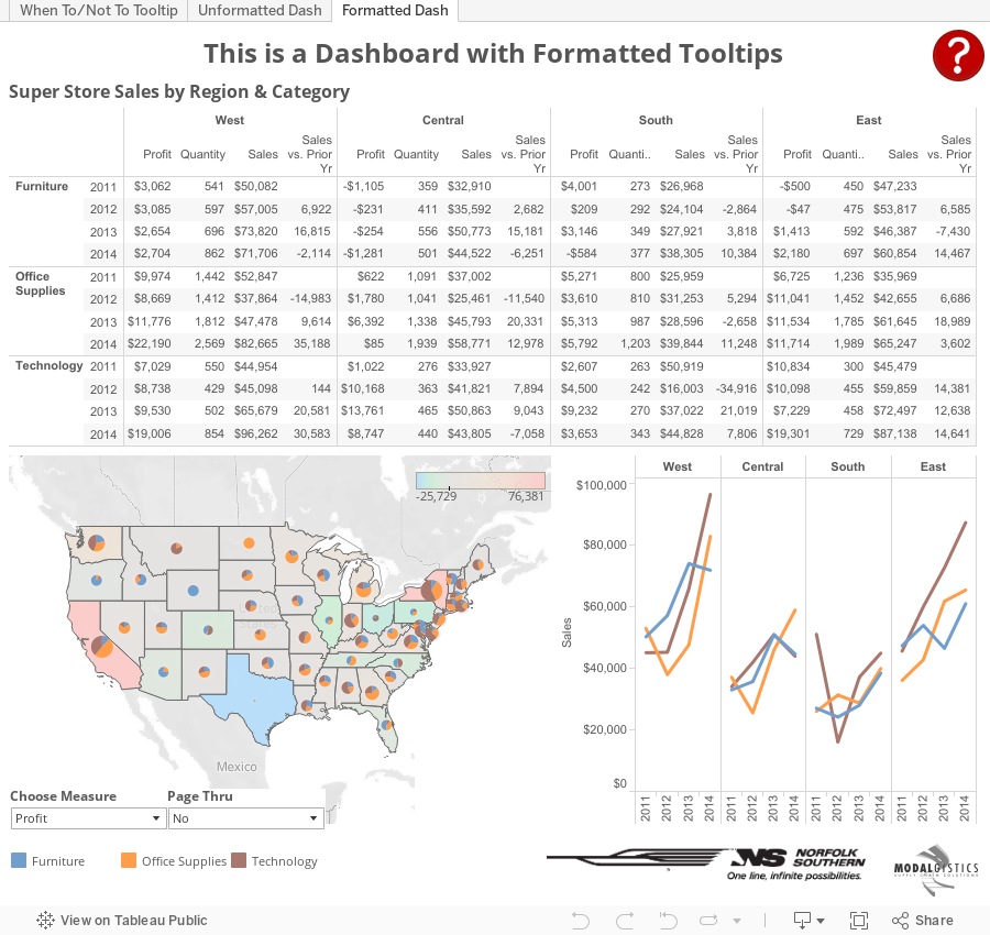
As you can see, I also did the same with Profit. Your finished result should look like this:

So you can check out what's been covered, download the Tooltippin' workbook and see how things were created. On the formatted dashboard you will also find an email URL action, a highlight action, hover help over a question mark, dashboard version and contact info associated with a group logo, and a sneaky way (using a parameter, an empty worksheet, and a container) to bring up and hide the Page Thru interface on the dashboard (unfortunately in v9.1.1, lines appear around the blank worksheet if you hover over it even though all lines are off).
You wouldn't get dressed up for a special occasion to put on unpolished shoes or a pair of flip-flops; so why would you leave your tooltips looking like this:

when you can make them look like this:

Lets take a look at when to and not to use tooltips, how to use tooltips effectively, and go through how you can polish up your vizzes using color and carats.
When to and Not to Use Tooltips
Use tooltips to:- Provide additional insight or information
- Provide context
- Spell out what is being shown
- Adds no additional or meaningful value
- Blocks or interferes with your chart
- Disturbs the mood or feeling of your visualization
Below are some 'Easy Peasy' ways to use tooltips effectively
(with some info coming from blogs by Andy Cotgreave and others on this subject)
The information presented below may be nothing new to those who've been using Tableau for quite a while, but for those just starting out, I hope this information helps you create better visualizations.
- Remove Include/Exclude command buttons
- Create a Header
- Use the mark's primary dimension or a brief summary
- Make it stand out from the rest of the tooltip
- Meaningful Information Only
- Ask yourself if you need to include every dimension and value?
- Rename field labels (if you keep them), so they are understood
- Promote Importance
- Your audience has a short attention span (perhaps a couple of seconds), catch it
- Reorder the fields and information presented so the most important items are at the top
- Use a Sentence Structure
- Reading a sentence is often more easily understood than a handful of column labels and values
- Doing so gives you the ability to place data in the proper context
Add Color and Carats to Tooltips
(thanks to Karen Hinson for providing this tip suggestion)
(thanks to Karen Hinson for providing this tip suggestion)
Using the SuperStore Sales data set, create a simple line chart. Place Region and YEAR(Order Date) on the columns shelf and SUM(Sales) on the rows shelf. Place Category on the color shelf.
Next, create some calculated fields to make some comparisons with (so we have a reason to use color and carats). I've used the following calculations:


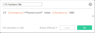
Next we need to format the fields so they are equipped with the carat symbol. To do this, open the Character Map application, choose a standard font (such as Arial), and scroll down until you see the ▲ and ▼ symbols. Select both and then choose copy.

Now you will need to format the default number properties for each of the Sales Comparison % fields you've created so they take advantage of the carat symbols. Do this by right clicking on the field name within Measures and selecting Default Properties followed by Number Format. Paste the values (Ctrl+V) into the custom format area, then set the custom format to ▲0.0%; ▼0.0%; 0.0%.

I would also like the Category to stand out in the tooltip; and through the use of color, this can be accomplished. There are three categories in this data set, so we'll need to create three calculated fields. Below are my fields.


Drag each of the Sales Comparison % fields and the tooltip title fields to the Detail Shelf. Go to Worksheet|Tooltip... and format the tooltip similar to the following:

When adding the Sales Comparison % fields (and the Category Title fields), place them back-to-back so that there are no spaces between them. Only the value that is appropriate will remain, the others will vanish (but if spaces are present between the fields, these spaces will also remain).
Now assign colors. I set the color of the category titles based on the colors found in the workbook. I also used a muted green and a muted red to show positive and negative sales percentage, and a dark grey for no increase or decrease in sales percentage.
As you can see, I also did the same with Profit. Your finished result should look like this:
So you can check out what's been covered, download the Tooltippin' workbook and see how things were created. On the formatted dashboard you will also find an email URL action, a highlight action, hover help over a question mark, dashboard version and contact info associated with a group logo, and a sneaky way (using a parameter, an empty worksheet, and a container) to bring up and hide the Page Thru interface on the dashboard (unfortunately in v9.1.1, lines appear around the blank worksheet if you hover over it even though all lines are off).
Friday, March 28, 2014
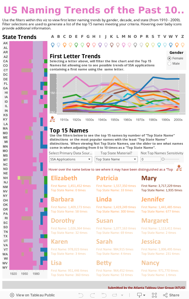
ATUG Viz Contest Submission
The Tableau User Group community is conducting a Viz Contest among the 100 or so user groups worldwide. Based on input from ATUG members at our February meeting, I've come up with the following viz for the group. Submission deadline is 3/31/14.
I hope you enjoy. Your feedback is welcomed and encouraged.
I hope you enjoy. Your feedback is welcomed and encouraged.
Tuesday, January 7, 2014
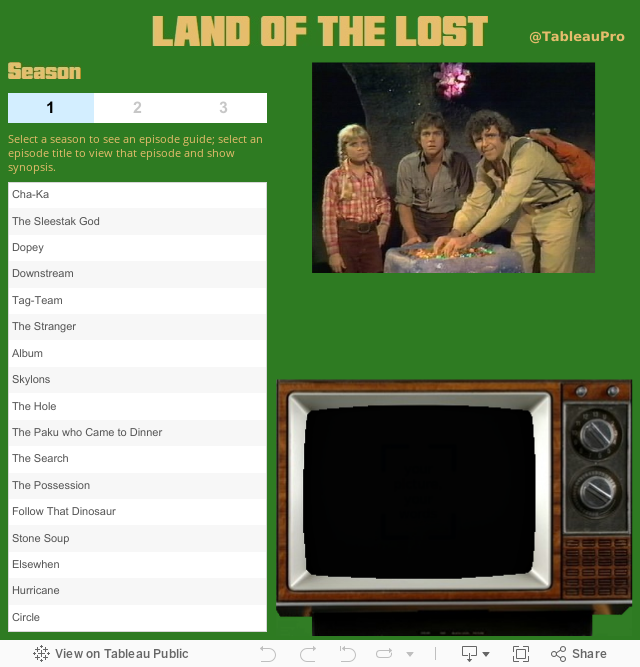
Land of the Lost Episode Guide
Growing up in the 70s, watching Saturday morning cartoons with my brothers was a time I look back at and smile. One of our favorite shows was Sid & Marty Krofft's Land of the Lost. With this viz, you can take a step back in time and watch every episode of Will & Holly Marshall's adventures. We may never know if they really made it home, but I hope you enjoy this bit of 70s nostalgia.
Wednesday, October 9, 2013
Autosave Tableau - You Can Do That
Tableau is one of many applications that would benefit greatly from an Auto Save feature. It's been a much requested feature from Tableau users for years. While not built into the application directly, you can now have your Tableau workbook save automatically every X number of minutes using a third-party tool called AutoHotKey.
All the credit for this great find goes to Nelson Davis, a recent presenter at TCC13. For instructions on how to set up Tableau to Auto Save, check out this post on Nelson's blog: The Vizioneer.
By the way, Nelson also went to GA Tech, the school where "You can do that". Thanks to Nelson's Tableau auto save instructions and AutoHotKey, now all of us can do that.
Thursday, July 25, 2013
Installing v8 on Development Server
Use of v8 in a test environment went really well and right now we're updating the company's Tableau Development Server with v8.0.3.
Here are my top 3 things I've liked about the v8 server (thus far):
1. The speed improvements of V8 with some of our data-intensive workbooks
Filtering in v7 within some views (querying hundreds of millions of records) was taking about 45-60 seconds to resolve after selecting a filter. With v8 and a few design changes to the filtering method (i.e.: replacing quick filters with tables when appropriate) brought the time down to 5 seconds or less.
2. Altering and authoring a viz from server
This feature is one I think many will experiment with, but likely one that only a handful of users will really work it over - those who don't want to develop will still come to those who do to try to get what they want. I suspect this feature will likely reduce the number of desktop licenses Tableau will sell to companies; but this also will entice companies to purchase Tableau Server and more core licenses.
3. Subscriptions
I think subscriptions has the potential to be great and one that many will take advantage of; but it is not quite there yet. Currently subscriptions are only time-activated -- by that I mean once a particular time has been reached (once a day at 7AM or the first of each week/month/quarter) the action to email the subscriber takes place. This will be suitable for most workbooks and users; however, there will be those workbooks and users that need subscriptions to be event-activated, so when an event occurs (i.e.: new data extract, workbook republished, new comment to workbook, a certain threshold has been reached in the data to trigger an alert, etc) that the subscriber is alerted.
Honorable mention goes to UI improvements (configurable column widths - about time) and improved admin views. The Java API would likely have made the top 3 had I had more time to play with it; I foresee us using this a great deal in 2014 as Tableau is rolled out to more within the company. I'm also looking forward to seeing how well Session Sharing does on a scale greater than my 15-20 v8 test environment.
Keeping my fingers crossed that the install continues to go as planned.
Andy
Wednesday, June 26, 2013
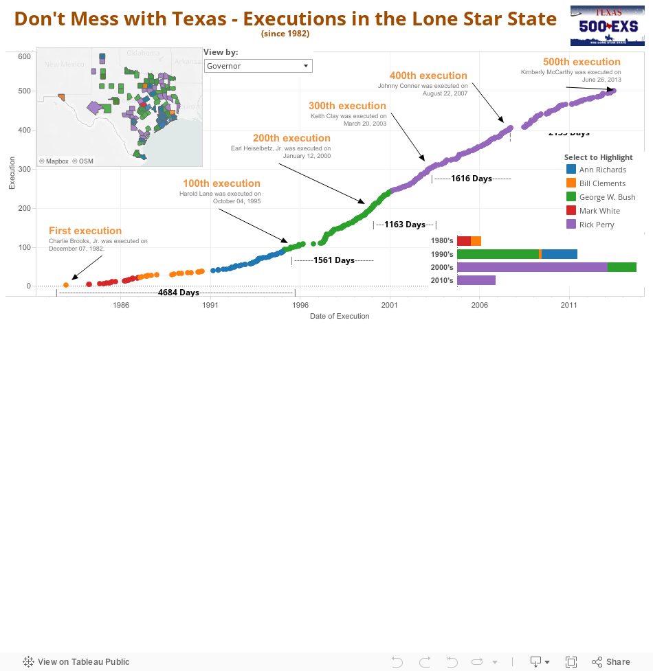
Don't Mess with Texas
Texas just executed its 500th inmate yesterday. For more information about the executions and inmates, check out the following viz:
Subscribe to:
Posts (Atom)