You wouldn't get dressed up for a special occasion to put on unpolished shoes or a pair of flip-flops; so why would you leave your tooltips looking like this:

when you can make them look like this:

Lets take a look at when to and not to use tooltips, how to use tooltips effectively, and go through how you can polish up your vizzes using color and carats.
When to and Not to Use Tooltips
Use tooltips to:- Provide additional insight or information
- Provide context
- Spell out what is being shown
- Adds no additional or meaningful value
- Blocks or interferes with your chart
- Disturbs the mood or feeling of your visualization
Below are some 'Easy Peasy' ways to use tooltips effectively
(with some info coming from blogs by Andy Cotgreave and others on this subject)
The information presented below may be nothing new to those who've been using Tableau for quite a while, but for those just starting out, I hope this information helps you create better visualizations.
- Remove Include/Exclude command buttons
- Create a Header
- Use the mark's primary dimension or a brief summary
- Make it stand out from the rest of the tooltip
- Meaningful Information Only
- Ask yourself if you need to include every dimension and value?
- Rename field labels (if you keep them), so they are understood
- Promote Importance
- Your audience has a short attention span (perhaps a couple of seconds), catch it
- Reorder the fields and information presented so the most important items are at the top
- Use a Sentence Structure
- Reading a sentence is often more easily understood than a handful of column labels and values
- Doing so gives you the ability to place data in the proper context
Add Color and Carats to Tooltips
(thanks to Karen Hinson for providing this tip suggestion)
(thanks to Karen Hinson for providing this tip suggestion)
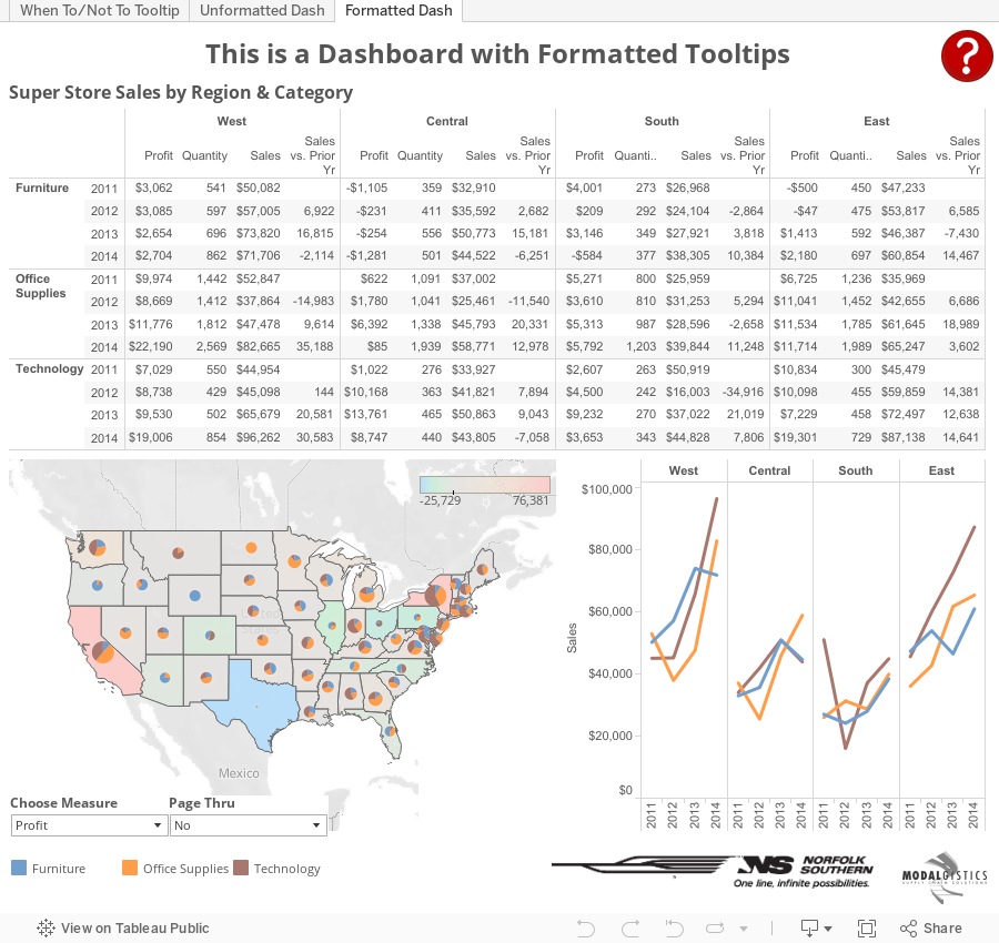
Using the SuperStore Sales data set, create a simple line chart. Place Region and YEAR(Order Date) on the columns shelf and SUM(Sales) on the rows shelf. Place Category on the color shelf.

Next, create some calculated fields to make some comparisons with (so we have a reason to use color and carats). I've used the following calculations:


Next we need to format the fields so they are equipped with the carat symbol. To do this, open the Character Map application, choose a standard font (such as Arial), and scroll down until you see the ▲ and ▼ symbols. Select both and then choose copy.

Now you will need to format the default number properties for each of the Sales Comparison % fields you've created so they take advantage of the carat symbols. Do this by right clicking on the field name within Measures and selecting Default Properties followed by Number Format. Paste the values (Ctrl+V) into the custom format area, then set the custom format to ▲0.0%; ▼0.0%; 0.0%.

I would also like the Category to stand out in the tooltip; and through the use of color, this can be accomplished. There are three categories in this data set, so we'll need to create three calculated fields. Below are my fields.


Drag each of the Sales Comparison % fields and the tooltip title fields to the Detail Shelf. Go to Worksheet|Tooltip... and format the tooltip similar to the following:

When adding the Sales Comparison % fields (and the Category Title fields), place them back-to-back so that there are no spaces between them. Only the value that is appropriate will remain, the others will vanish (but if spaces are present between the fields, these spaces will also remain).
Now assign colors. I set the color of the category titles based on the colors found in the workbook. I also used a muted green and a muted red to show positive and negative sales percentage, and a dark grey for no increase or decrease in sales percentage.
As you can see, I also did the same with Profit. Your finished result should look like this:

So you can check out what's been covered, download the Tooltippin' workbook and see how things were created. On the formatted dashboard you will also find an email URL action, a highlight action, hover help over a question mark, dashboard version and contact info associated with a group logo, and a sneaky way (using a parameter, an empty worksheet, and a container) to bring up and hide the Page Thru interface on the dashboard (unfortunately in v9.1.1, lines appear around the blank worksheet if you hover over it even though all lines are off).
This comment has been removed by the author.
ReplyDelete